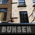
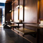
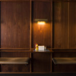
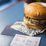
Our third Bunsen continues the strategy of creating bespoke interiors that respond to their location. Now 3 links in a chain where the product is consistent while breaking with the generic branding and visual identity associated with ‘fast food’. This interior uses feature chevron tiling and mahogany veneered ply walls with Scottish red sandstone aggregate polished concrete counters. The interior features feature bespoke wall and pendant LED lighting in Mahogany and Brass which we designed specifically for this interior. Externally there is no fascia signage and working with Revert Design we produced a redux version of a classic illuminate projecting sign which forms a visual dialogue with the other signs on South Anne street’s north elevation.
Branding & Visual identity by Revert Design


